Project Details
Categories
Testing, UX Design, Web/UI
Client
VIU Eyewear
Date Added
3. Januar 2020
Project Brief
Cutting-edge design meets expert craftsmanship. VIU’s mission: make prescription lenses and sunglasses that fuse timeless aesthetics with innovative technology. The result: frames that suit every personality and style, a commitment to fair prices and a transparent production process.
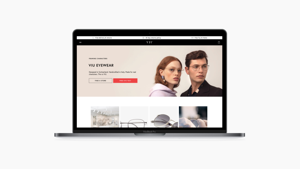
VIU is a Swiss eyewear label with headquarters in Zurich and Munich and a total of 56 flagship stores and 42 partner stores. In addition to its successful retail stores, VIU operates an online shop and follows a very sophisticated online marketing strategy.
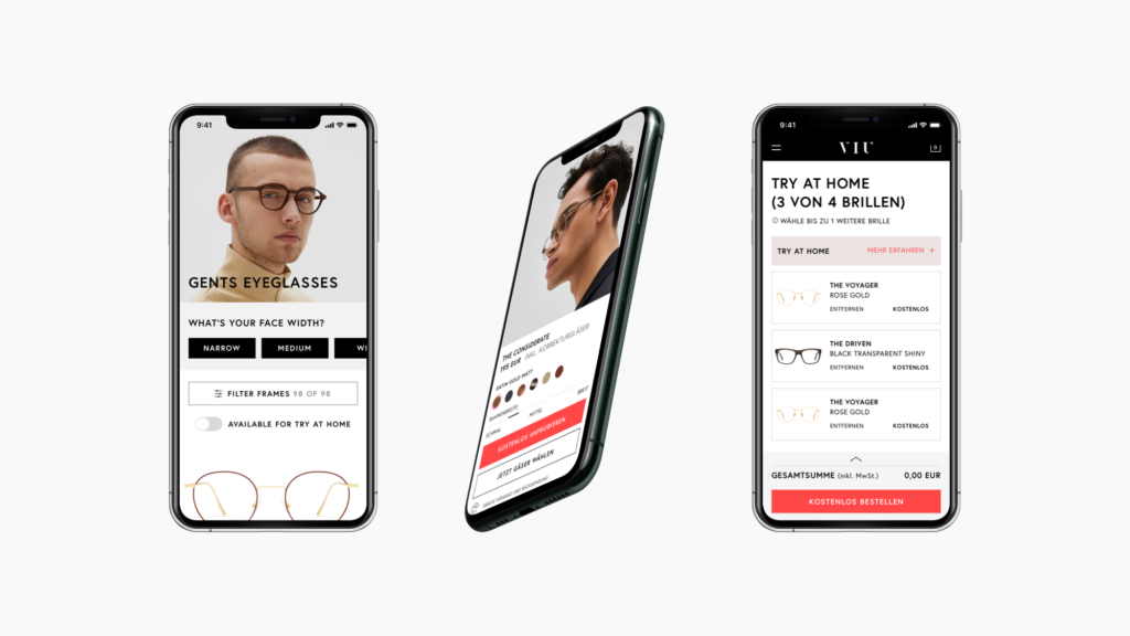
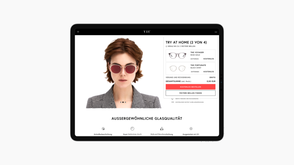
One of the special features of VIU’s online strategy includes the “Try at Home” program, where the customer can order four pairs of glasses online and free of charge to try on the glasses at home over the course of a few days. This is particularly helpful for customers who do not have a retail store nearby or are not yet sure which model fits their character.
Functions
As a working student in UX Design I was part of the Online Marketing team with the task to disrupt the online market and revolutionize the way, eyewear is sold online.
The main objective for the web shop was based on a multi-channel approach with the aim of bringing together VIU’s online and offline businesses. To achieve this, “Try at Home” was introduced. Customers could order glasses for free and try them at home with the goal to drive them into the stores afterwards. Since this concept has proven to be very successful, the online marketing strategy was based on how to use this lever and optimize conversions.
An area of responsibility for me was the implementation of E-Commerce basics. As the new VIU online shop was just launched when I started my job, bugs had to be fixed, concepts remodelled and missing functions realized. This included, inter alia, to:
- turn a branding website into a functioning online store
- implement a better performing product feed
- improve the product detail page and present the users more relevant information
- update newsletter designs to match the new corporate design
- redesign the whole checkout process including the configuration of glasses
- remodel the shopping cart to meet the learned expectations of users
- elaborate landing page designs and specify design guidelines
- provide the users with better transparency, e.g. through USP bars and customizable information widgets
Furthermore to give users more confidence in their online purchasing decisions a “Virtual Try On” was implemented. By using the devices camera and 3D models of glasses this system was able to project glasses onto the users‘ heads. The measurement, how successful this system was and how the visual integration of this system on the website would look like, was done by the UX team.
Besides the development of a style guide and a sketch design library my main tasks included:
- conducting UX research through user interviews
- administering usability tests including Axure/InVision prototype testing
- creating and evaluating A/B tests using Google Optimize and Hotjar
- investigating in which direction the VIU online business can be improved and reviewing existing assumptions and personas
- drawing wireframes, creating pixel perfect designs and providing developers with specifications
- coordinating stakeholders and creating drafts based on the corporate image
- testing of additional tools like chat bots or mailing services
Specifications
‣ Employment form: Working student
‣ Working time: 20h/week
‣ Platform: Web
‣ Backend: PrestaShop
‣ Project management tools: Asana & Jira
‣ Access under: www.shopviu.com
